This is intensely hard for me to comprehend. I need to take a pause to reflect a little while longer. I mean there’s no such thing right? There is no non-functional architecture?
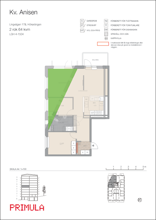
So, what seems to be the problem if any? In the drawing above I have superimposed the layout of a two-room apartment on the three-room equivalent in the same building – there are four identical buildings and the floors are mirrored and more or less symmetrical as far as I can tell. The green-coulured part is the difference in liveable area between the two and according to the plans a two-room apartment has an area of 64m2 and a three-room has respectively 77m2.
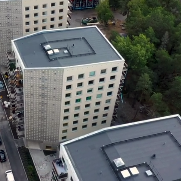
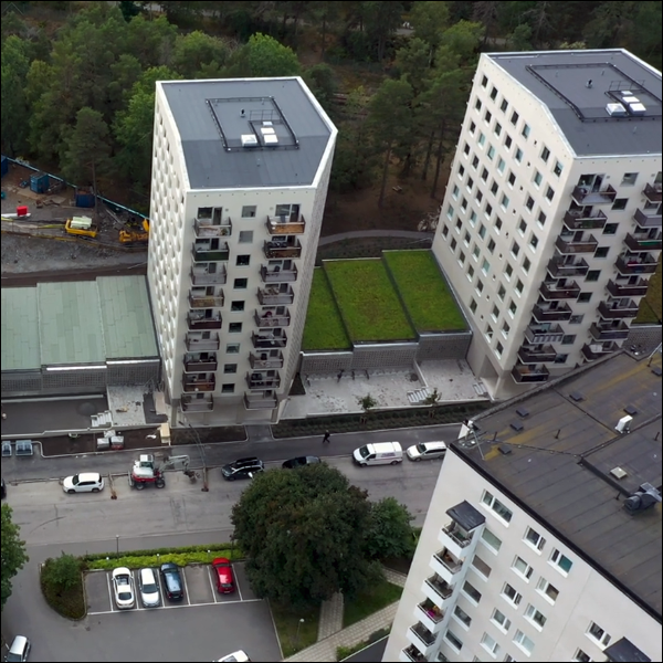
Yes? So, the two-room apartment has a smaller liveable area? Well, that’s perfectly normal is it not! Why would that be problem and how is that non-functional? You need to look at the layout/footprint in combination with the facades of the buildings in question. That was what originally made me intrigued, because, when I first saw them I could not see any apparent reason what so ever for angling the structures to begin with – apart from possibly aesthetics?
In my mind this design choice poses a number of difficult questions:
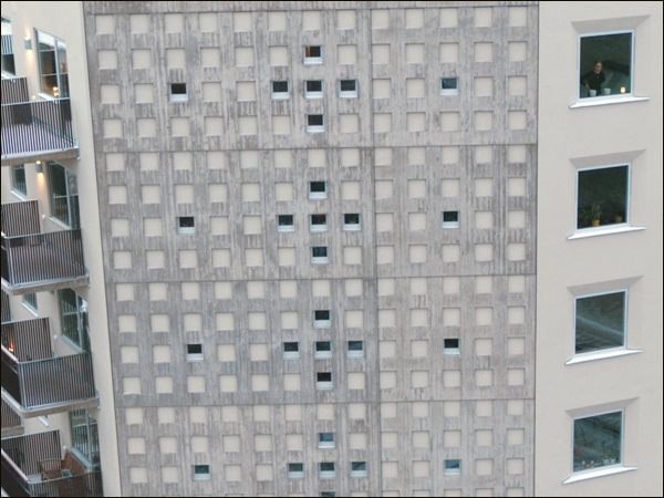
- Light or lack thereof in the two-room apartments?
- How will anyone successfully furnish said apartments?
- Why would you remove 13m2 or more per floor in a nine story (or any) building?
- Would it have been possible to make one-room apartments out of a three-room apartment layout?
- The slanting of the roof? Why would you lower the ceiling height purposefully of the top floor?
- Was it a financially rooted decision? Did it lower the overall building cost or did it in fact add to final construction cost?
- Are these purely aesthetic considerations/decisions** in order to avoid symmetry completely? Void of any functionality what-so-ever and thereby some kind of non-functional architecture?
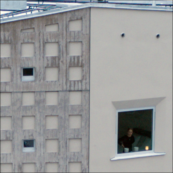
- I don’t know what to say/think. It congers an uncunning feeling. Maybe like the tenant seeing/feeling the presence of a drone from her bedroom window (one of two full sized windows exsiting in the two-room apartment) on the ninth floor.
Lingvägen 182-184 – Projekt
Byggnadsår: 2020
Arkitekt: DinellJohansson
Ägare: Primula Byggnads AB
Yta: 5546m2
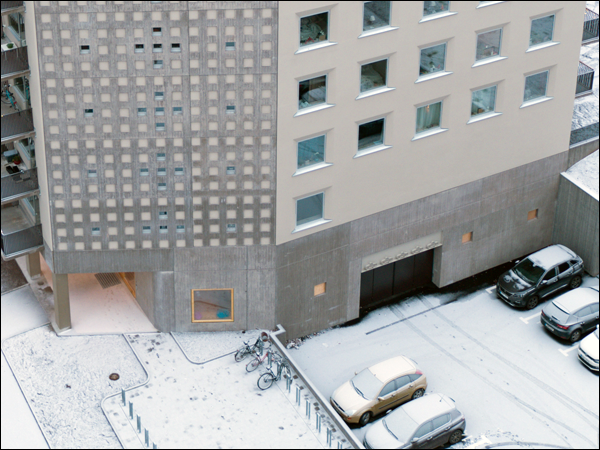
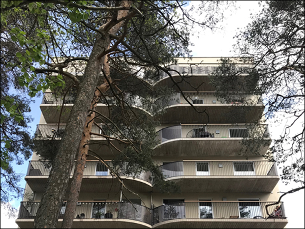
** Other similar lines of thought; the curvature of the rear balconies (less area would be less desirable), the absence of an underground structure, i.e. a basement and/or garage. Cars (and bikes) like to be indoors as well, but I don’t think they object terribly not being on the ground/street level as such. The buildings are quite bottom heavy to my taste and it seems impossible to pass in between them. Standing four in a row makes for quite a stroll if you would like to access the back of the building complex. Maybe you happen to be an avid train-spotter?

